ITP Data Analytics: Pie Chart Analysis - Time Period Report
This section displays the results of your filter selections in a pie chart. The chart displays the number of blocks or allocations related to the specified counterparties on the report. These pie charts enable dynamic views of your data, showing the top occurrences for different categories. Pie Chart Analysis is only available for CTM, and it is not available in the free version of ITP Data Analytics.
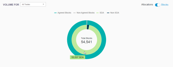
Use the Volume For drop-down list to specify the category to display:

Use the toggle to specify whether to show Allocations or Blocks, and place your cursor over a segment of the chart to show the total for that segment.
The following figure shows allocations for the Top 10 Counterparties. If there are fewer than 10 Counterparties, all are included.

The following figure shows the Total Blocks for All Trades.